netrefer
Revamp of a development-led platform for the affiliate marketing

Duration of project: Aug 2019 - Jan 2020
Executive summary
NetRefer operates at the intersection of affiliate marketing, financial remuneration, and business intelligence. The company provides two distinct platforms to their B2B and B2C customers. The Marketing Platform serves enterprise clients managing complex commission structures, media assets, and deep reporting. The Affiliate Platform serves promoters who need reliable tracking, analytics, and financial tooling. Both platforms had accumulated years of engineering-led feature development with no structured design process. This resulted in fragmented information architecture, redundant workflows, and a product experience that was falling behind global competitors.
I was brought in to lead the UX strategy and end-to-end redesign of both platforms, operating as the senior design voice across a cross-functional team of product owners, engineers, and business stakeholders. The North Star objective was to transform the two technically capable but usability-compromised platforms into competitive, scalable products, and to establish the design infrastructure.
Discovery & strategic insights
The team had operated successfully under a development-to-design model for years. Features were scoped by what was technically possible, not what users actually needed. Gaining traction for a user-centred methodology required building credibility before changing process.
I orchestrated an internal UX alignment campaign with workshops, cross-team Q&A sessions, and stakeholder presentations. Focused mainly on demonstrating shared outcomes, how earlier design intervention reduces development rework, lowers support ticket volume, and shortens release cycles. Once the team understood UX as a risk-reduction mechanism rather than an aesthetic layer, collaboration followed naturally.
Auditing the existing architecture
The discovery phase began with a comprehensive audit of the legacy platforms. I reviewed the existing technical architecture, conducted a competitive analysis against global affiliate and fintech platforms, and ran structured interviews with internal product owners and developers to map the full scope of accumulated technical debt.
What emerged was that standalone features had been designed in silo over time without a unifying information architecture. Navigation was incoherent and many workflows edundant, or over engeneered. Users were solving problems through workarounds rather than through the product itself.
Synthesising user insight under constraints
I kept the research methodology lean but high-signal. The quantitative data from platform analysts identified where drop-off and friction were highest. I spent significant time operating the legacy platform myself, performing real tasks as real users would, to surface friction that interview data alone would not reveal.
The platform complexity was mostly due to accumulated design debt. The underlying tasks were manageable but the interface made them unnecessarily hard.
These findings were synthesised into a phased design roadmap and used to align the team around a formal DesignOps structure, shifting the organisation from reactive feature delivery toward a sustainable, research-informed product process.
3. The solution
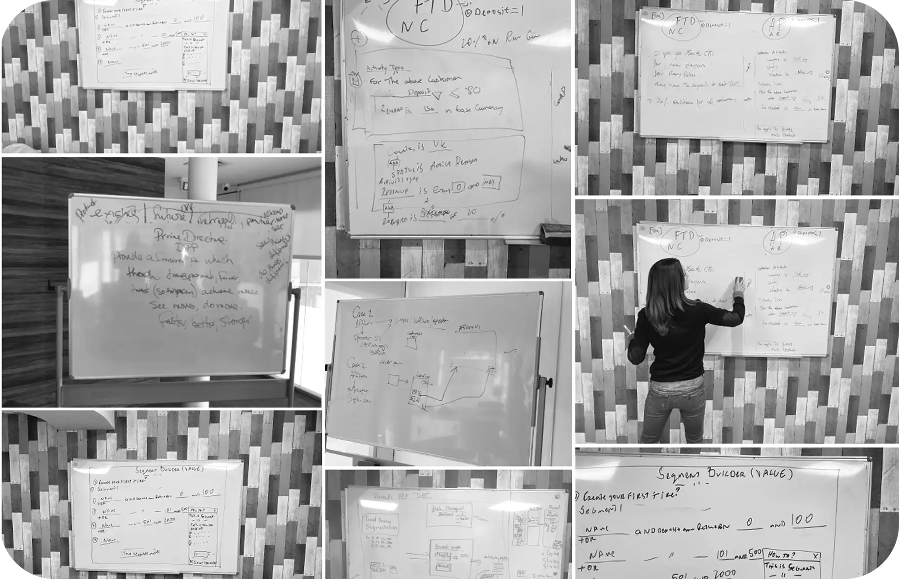
Redesigning the Reward Rule Builder
The most complex design challenge on the platform was the Reward Rule Builder. The Engine through which clients construct financial commission logic. The legacy tool was complex, text-heavy, and offered no visual guidance through the configuration process. The new version needed to support gamification mechanics, goal bonuses, multi-tier incentive structures, and point systems that had not previously existed in the product.
The design constraint was that the new tool had to be operable in under five minutes for standard configurations, while remaining capable of supporting deeply layered, multi-condition commission logic.
I applied a Define-Journey-Test framework. Functional prototypes were built in Axure to validate complex interaction models with real users before committing to high-fidelity design. The redesign structured the configuration process into logical, sequential steps that mirrored how users naturally reason about commission logic. A modular visual rule interface replaced the text-configuration model, reducing complex commission build time from hours to minutes and significantly cutting support tickets tied to configuration errors.
Restructuring the data grid
User feedback on reporting was that the existing data grid presented 30 to 40 columns simultaneously, when users typically needed 10% of that information at any given time. The volume made relevant data difficult to find and reports difficult to act on.
I architected a hierarchical filter system with collapsible categories and user-defined custom views. This helped to transform the data grid from a dense information wall into a configurable, task-specific reporting tool. To reduce adoption friction during the transition, I introduced a dual-mode experience: users could view their legacy layout alongside the new interface simultaneously, migrating at their own pace rather than facing a forced cutover.
Neither platform had an existing design system or component library. I built one from scratch and established design tokens, component standards, and a shared pattern library that provided engineering with the autonomy to ship updates across products.
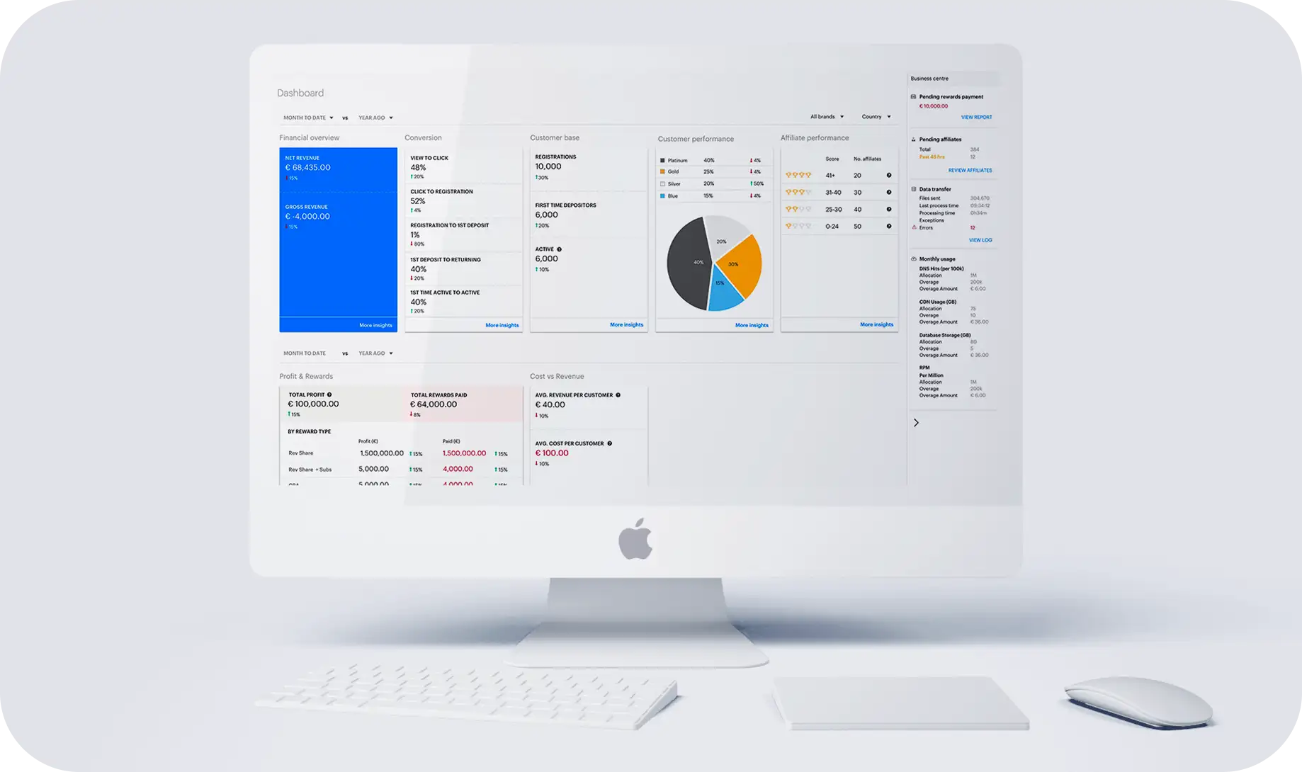
Netrefer allows clients to create dashboards from the data they track. To support this flexibility, we defined clear rules and styles so every visualisation remained consistent and readable.
4. Impact & business value
The redesign delivered measurable results within the first month of launch.
Quantifiable outcomes
- 95%+ platform adoption within the first month
- Configuration time reduced from hours to minutes on the Reward Rule Builder
- Support tickets related to configuration errors dropped significantly following the visual rule interface launch
- C-suite signed off on a permanent Agile-UX framework - embedding design as a standing function within the product development lifecycle
Qualitative outcomes
- A scalable design system gave engineering the ability to ship consistently without design as a bottleneck
- Formal DesignOps structure established a repeatable process that outlasted the engagement
- Brand identity was modernised with a cleaner, more coherent visual language across both platforms
The long-term value
A product team that understands who it is building for, and why each design decision was made, ships better work with less rework. That is the compounding return on a well-executed design system and a well-embedded research practice.